Internet hates Nikhil Kamath's cluttered decor at new home: Here's how to nail the maximalist aesthetic
Zerodha co-founder Nikhil Kamath's apartment exemplifies a maximalist aesthetic disaster. Check out what went wrong and how you can do it better.
Pictures of Zerodha co-founder Nikhil Kamath’s apartment surfaced online, drawing negative feedback from netizens, calling it ‘an absolute travesty.’ The home decor had a jarring maximalist aesthetic with discordant colours and patterns clashing and creating visual chaos.

As new homeowners, it is easy to fall into the trap of going overboard with the decor. But too many cooks spoil the broth, similarly, too much decoration feels too gaudy and cluttered. The result is essentially a bizarre, organised chaos that causes visual exhaustion. Maximalism always locks heads with minimalism, with the latter doing everything right by putting simplicity at the forefront.
Not to villainise the maximalist aesthetic, but the lavish abundance can be done right by maintaining a thorough synergy in all the elements, where each unit feels part of a grand whole. Maximalism is not an excuse for dumping anything and everything in the room for the sake of it. The interior decor has to feel inviting and warm like ‘home’ and not a madhouse with unicorn vomit.
Let’s see by analysing what’s wrong with Zeroda co-founder Nikhil Kamath’s maximalist apartment so you can avoid these mistakes.
ALSO READ: Internet unimpressed with Nikhil Kamath’s maximalist apartment in Bengaluru: ‘You can afford better’
Bedroom

At the first glance itself, the room appears to be imposing with its unharmonious shapes. The room has a lot of shapes; from the angular frame of the bed to the circular mirror, with the lamp and carpet in rectangular shapes. All these distinct shapes stick out like a sore thumb, coordinating with nothing in particular. No particular colour scheme is followed, which makes each element look unsettling. The floral wall’s colours have a high saturation, which doesn't well with the subdued blue in the carpet or the curtain. The rectangular stand for the lamp looks like a fish out of water, almost purposeless for the bigger picture. If the bed had wooden frames or was in a neutral colour, the wooden lamp stand would have made more sense.
Lessons learned here: Proritise not only a strict colour scheme but also ensure the colours have similar saturation levels, vibrance, and sharpness. Maximalist decor especially needs a synchorisation in all the colours being used.

Shapes are another aspect to focus on; there needs to be harmony in the shapes of the furniture. For an angular bed frame, either something equally chiselled and jagged needs to complement it, or go down the risky route of opposites-attract style by adding more rounded elements to the decor to tame the sharpness of the jagged furniture. If the jagged furniture is the statement piece as statement pieces are one of the fundamentals of maximalism, tone down the rest of the furniture for it to truly stand out.
Balcony

The balcony suffers from an ugly clutter of aesthetics. The canopy-like seating area has a lot of pillows with patterns that don't go together. While the canopy furniture somewhat had the potential to radiate a rural cottagecore aesthetic, the rug got in the way. The rug’s prominent texture clearly had an earthy, hippie style, which doesn’t go well with the simplicity of cottagecore. However it would have been fine, following the woodsy, brown monochrome, but the birdcages ruined it. The candles in the birdcages felt very gothic, completely opposite to the subtle elegance of the earthy aesthetics.
Lesson learned: Do not try to push all your Pinterest boards into one room, otherwise it will turn into a big mess. Stick to one particular aesthetic. It’s completely fine to go for different aesthetics, every room has a personality.

Maximalism is all about going bold and large, but with logic and sanity. The attempt to mix and match aesthetics is a disaster. Stick to one aesthetic and build towards it with attention to detail in each element. You can even go for quirky aesthetics like bohemian boldness or overly artsy style, but don’t mix them.
Dining room

The dining room is completely out of sync, and most importantly, incredibly claustrophobic. There’s no room to breathe. It’s a common mistake for maximalist decoration. The belief of more, the merrier is flawed in this context. The room has too many colours and patterns- be it the solid green wall with a patterned black wall or the mismatched sofa set. The chunky golden center table feels awkward and instead of being a supposed ‘statement piece’ is more like a visual obstruction, like a very bad jumpscare.
Lesson learned: Maximalism is not synonymous with too much, so please do not overcrowd with excessive furniture. Let the room breathe.

Living room

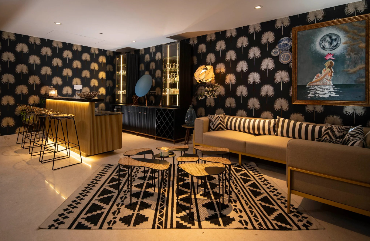
The lounging room again suffers from ‘too much pattern syndrome’ almost to the point of visual nausea. While the colour scheme and the ambience lighting achieve some semblance of uniformity, the awful patterns ruin the mood. The patterns on the wall are too loud and crowded. Even the sofa cushions have patterns. The planet-charm-like decor next to the wall is barely visible amidst the jarring wall.
Lesson learned: This highlights one of the most common mistakes- patterns. Eye movements feel fatiguing and overwhelming in a room with too many different patterns. They disrupt the smooth flow of a comfortable eye movement.

ALSO READ: Home decor: 9 budget friendly tips for luxurious interior design


