Google changing logo of Chrome browser after 8 years. All you need to know
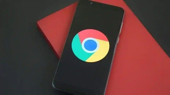
Google Chrome logo: From 2008 until now, the Chrome logo has been getting gradually simpler. What started out as a shiny, three-dimensional emblem has been squashed down into a 2D symbol.
Tech giant Google is changing the logo of its popular internet browser Chrome. The subtle change is coming after eight years, and according to Google Chrome designer Elvin Hu, will give the product a “modern experience”.

In long Twitter thread, Hu said the changes have been made based on the different operating systems Chrome appears on. “On ChromeOS, they use brighter colors without gradients to match the looks of the rest of system icons. On macOS, they look 3D. For Beta and Dev, we applied colorful ribbons to them,” he said.
The new logo started rolling out from February 4 and is currently available on Chrome Canary (the developer version of the browser). It will be rolled out for everyone else over the next few months.
“We simplified the main brand icon by removing the shadows, refining the proportions and brightening the colors, to align with Google's more modern brand expression,” said Elvin Hu.
“Fun fact: we also found that placing certain shades of green and red next to each other created an unpleasant color vibration, so we introduced a very subtle gradient to the main icon to mitigate that, making the icon more accessible,” he added in subsequent tweet.
Due to these changes, the blue circle in the middle seems to be bigger. The colours in the logo also look more vibrant.
The designer then explained why the change is so subtle.
“You might ask, “why bother with sth. so subtle?” We tailor Chrome’s experience to each OS, with features like Native Window Occlusion on Windows, day-one M1 support on macOS, Widgets on iOS/Android, and Material You on Android. We want our brand to convey the same level of care,” said Hu.
He then asked for feedback, which will help the team improve the product.
From 2008 until now, the Chrome logo has been getting gradually simpler. What started out as a shiny, three-dimensional emblem has been squashed down into a 2D symbol.


