Track pollution in your city with this real-time air quality map
Monitoring the pollution data will aid you to spot any sudden changes in air quality, and follow up with action - putting on a certified mask, turning up your air purifier, or demanding action from authorities.
In Delhi, everyone knows we have a pollution problem. Citizens who weren't aware of it before the AAP government's odd-even traffic scheme, are definitely aware of it now.

But if you ask the average person what the air quality is like right now, in the places where he or she lives, works, and plays, very few will be able to answer you. And if you go outside of Delhi, where pollution has been a headline issue for two years, insight into India's widespread air quality crisis is much more limited.
At Hindustan Times we believe that credible, relevant, and actionable data empowers you to make decisions about your health and to hold public representatives accountable for the policies that they adopt and implement.
Unfortunately, when it comes to air pollution, that kind of data has historically been hard to find, hard to make sense of, or just plain missing. To fill in some of the gaps, we have built a new platform to bring you timely, reliable, information. To do that, we have built an online map, which captures regular inputs from all of the government's air-quality monitoring stations across the National Capital and around the country in one, easy-to-access website, which also works well on mobile phones.
Monitoring this data will also aid you to spot any sudden changes in air quality, and follow up with action - putting on a certified mask, turning up your air purifier, or demanding action from authorities. It will also enable our newsroom teams to spot problems, identify trends, and investigate causes.
To achieve these objectives, the government data alone will not be enough. There simply aren't enough stations to create a detailed picture, and at times the provision of data may be delayed at some locations. For that reason, we have designed our platform to accommodate multiple sources of reliable air quality numbers. In the coming days these will include low-cost but accurate sensors that we have deployed around the city, networks of sensors deployed by citizen groups, and data from research institutions. By combining all of these we will be able to provide the most comprehensive and meaningful real-time picture available of air quality in India.
You will be able see the Air Quality Index at a glance. AQI is a number which captures the overall level of pollution and gives you an immediate picture of its potential health impact. You can also drill into the data, and check the level of the tiny, dangerous, particles known as PM 2.5 that pose such a serious risk to inhabitants of Delhi and other cities.
How did we develop this map?
We explored all the possible sources of air quality data available in public domain and determined that the major issues are in terms of accessibility and user interaction.
We started with Central Pollution Control Board (CPCB) which comes under the Ministry of Environment & Forests, Government of India. They have installed approximately 60 automated air quality monitoring stations across India., with 9 stations in Delhi.
There are also the State Pollution Control Boards like Delhi Pollution Control Committee, Karnataka State Pollution Control Board, which monitor the data in their respective states and comes under the purview of CPCB.
The United States Embassy is also monitoring air quality at its offices and their data is easily accessible.
Finally, inexpensive but accurate devices that both HT and citizen groups have deployed, are being added to the platform and will be contributing data in the coming weeks.
Once we had a process to bring all of these numbers onto one platform, we worked hard to make it easy to find and use, with a simple interactive map, and tools for investigating the numbers at locations that matter to you.
How can you use the map?
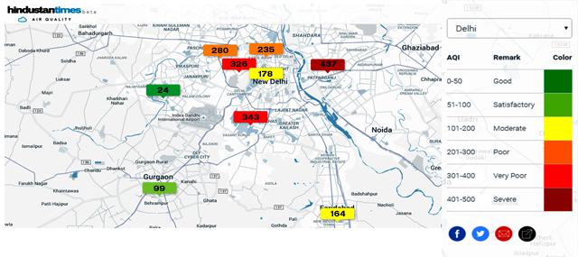
When you visit the platform, you can select a city of your choice and the map will show you the level of air quality at several stations. You can skip selecting a particular city and instead see a pan-India map as well. You can also choose different cities from the dropdown menu.

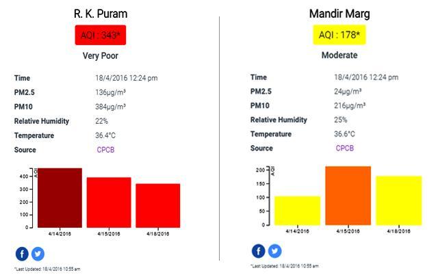
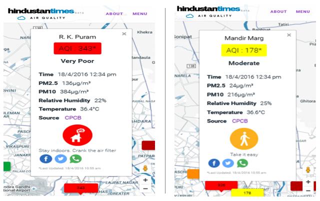
Once you select any city, you will see colour-coded boxes showing different values for particular locations. The value in these represents the AQI (Air Quality Index) at that place. You can refer to the legend on the map. If you click on the box, you will see a card which shows the values of major pollutants like PM2.5, PM10 etc. Apart from reporting these raw pollutant values, we are also converting it to the AQI (Air Quality Index) so readers can make sense of them. Unlike some international apps, we use the Indian AQI framework.


At the bottom of the card, you will see a graph of AQI for the last seven days. This is very important as it gives us a clear picture of how the air quality has been in the last few days. Sometimes in the graph, you might see the data for only one or two days. This is because the data may not be available for the other days. If you open the map on mobile, you will be able to decide if it will be healthier for you to go out for a walk or if you need an air pollution mask to go out. This is our effort to make the data more meaningful and actionable.
Is it perfect?
No. Data from some stations may lag, or drop out entirely. Where that happens, we've added an asterisk (*) sign on the AQI label on the card and shared the time of last update at the bottom. Adding more independent monitoring devices will help to make this problem less serious.
We are still developing the platform to improve user experience and will be adding more features, so you may face some bugs. We encourage you to report any problems you may face so we can make our platform better.
We hope that our small effort will go a long way in improving the awareness on this issue, making information accessible.
Click here to view the real-time air quality map.


